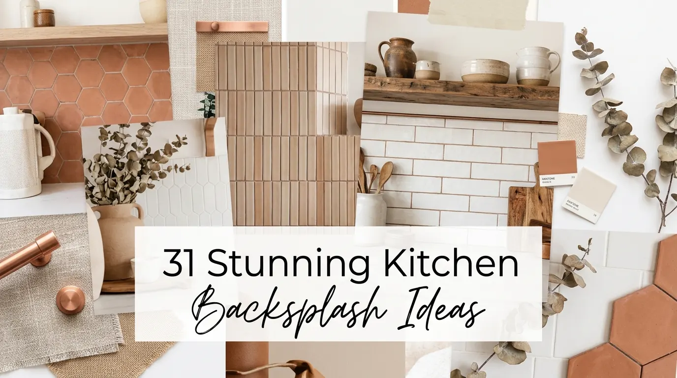
A kitchen backsplash can completely change how your space looks and feels. Whether you want something sleek and modern, warm and rustic, or bold and artistic, the right tile makes all the difference. In this guide, I am sharing my favorite kitchen backsplash ideas to help you find the perfect style for your home.
When I was redesigning my own kitchen, the backsplash felt like the most personal choice I made. It tied everything together. The countertops, the cabinets, the lighting — the backsplash spoke to all of it.
In this article, I cover styles, materials, colors, and layout ideas so you can walk away feeling confident and inspired.
Classic White Zellige Square Tiles
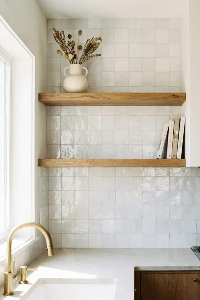
I keep coming back to white Zellige tiles because no other tile has that same handmade, imperfect charm. Each square catches light differently, giving your backsplash a soft, living texture that flat tiles simply cannot replicate.
I love pairing them with warm Edison bulbs and natural wood shelving. The contrast between the glossy, irregular surface and organic wood feels so cozy and collected.
Vertical Stacked Subway Tile
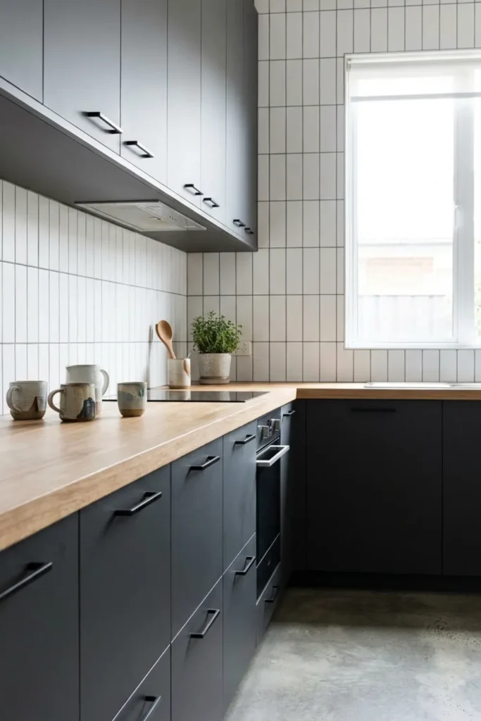
Most people think subway tile is played out, but flipping the layout vertical completely transforms the look. Stacking tiles vertically draws the eye upward, making your kitchen feel taller and more open.
The real secret is the grout. I always recommend a dark charcoal grout against white tiles. It sharpens the whole design and gives a modern kitchen that sleek, intentional finish.
Continuous Honed Marble Slab
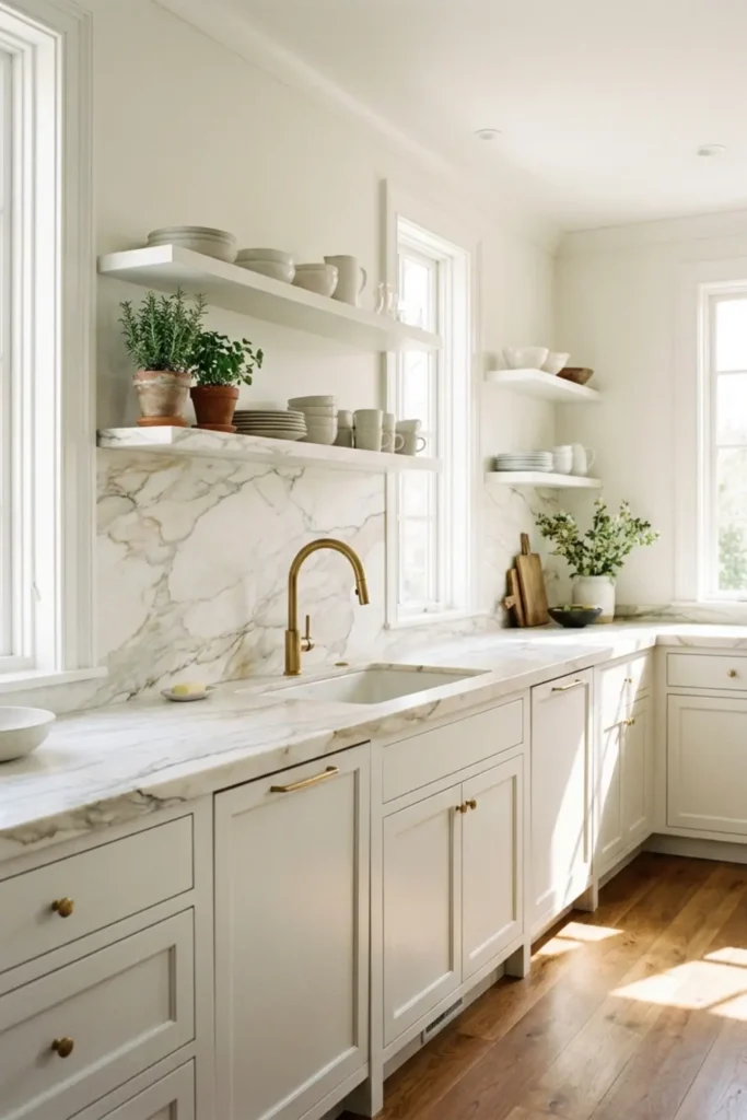
Nothing reads luxury quite like a full marble slab running from countertop to cabinet with zero grout lines interrupting the flow. It is clean, seamless, and genuinely breathtaking in person.
When I style this look, I always match the backsplash slab to the countertop stone. Keeping the veining continuous across both surfaces makes the whole kitchen feel like one intentional, elevated design.
Earthy Terracotta Hexagons
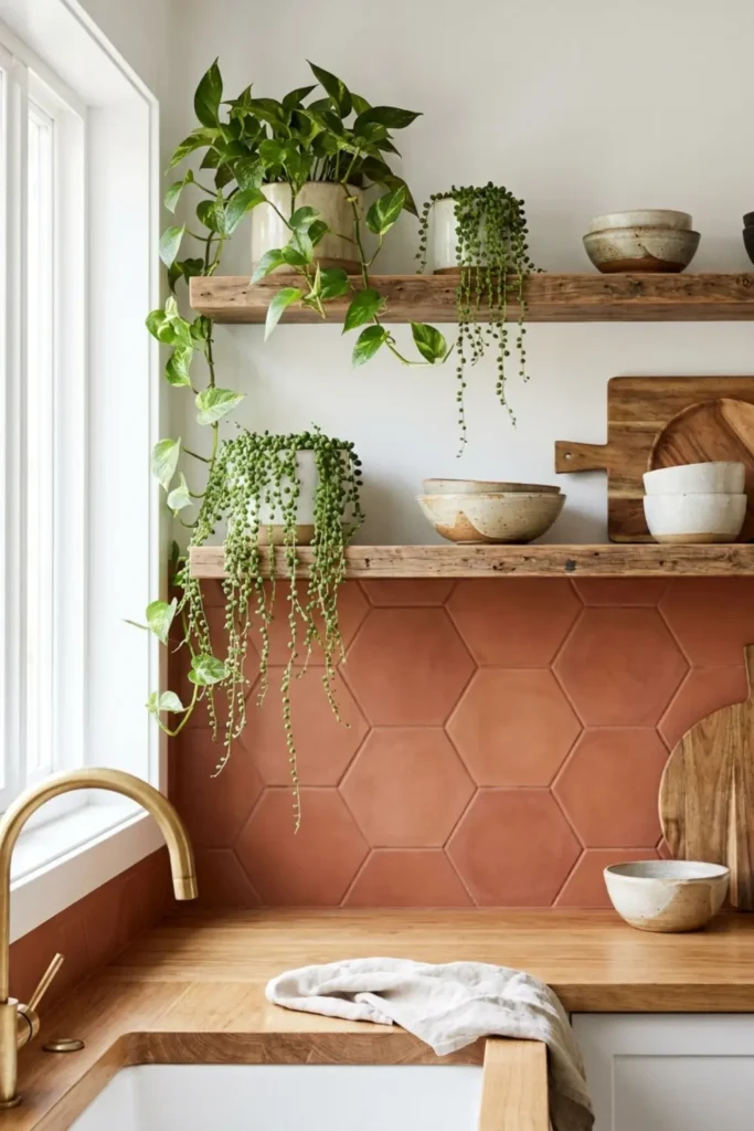
Terracotta hexagon tiles bring an instant warmth into the kitchen that feels deeply rooted and organic. The matte, clay-toned surface adds color without shouting, which makes it incredibly easy to style around.
I love layering in brass fixtures and trailing green plants against terracotta. The combination feels fresh and earthy at the same time. It is one of those looks that feels both timeless and very right now.
Moody Dark Green Glossy Brick
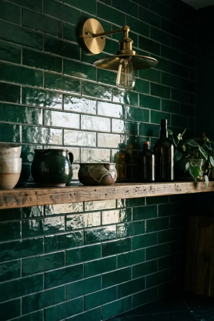
Dark green is one of those colors that looks intimidating on a swatch but absolutely stunning on a full backsplash wall. The glossy finish reflects light beautifully and gives the kitchen real depth and drama.
I always balance it with light countertops, creamy white or soft grey work perfectly. That contrast keeps the space from feeling heavy. Pair it with a vintage brass fixture and the whole kitchen feels rich and inviting.
3D Fluted Ceramic Panels
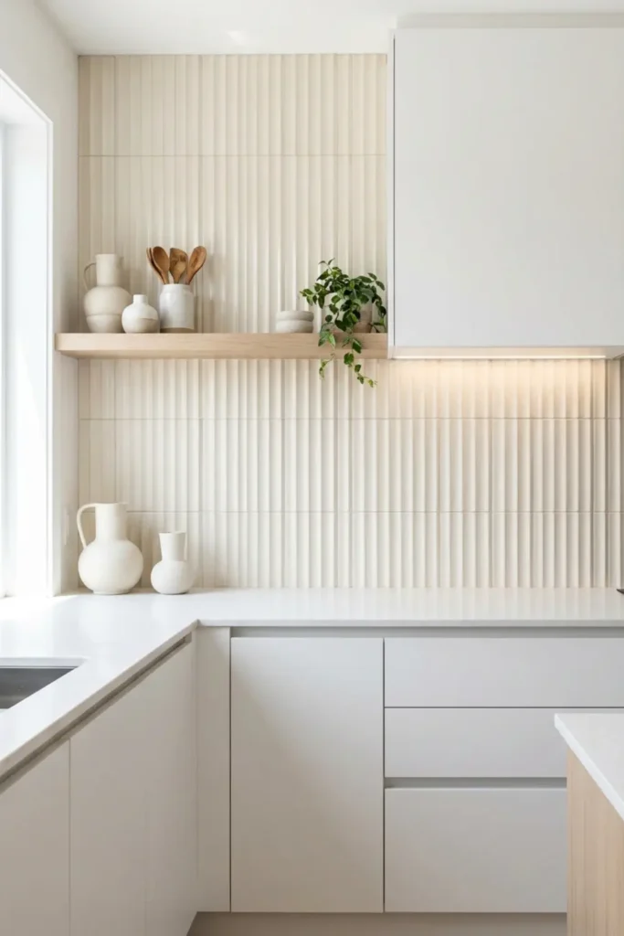
Fluted ceramic panels are where texture becomes the design. The raised ridges catch light at every angle, creating soft shadows that make your backsplash look alive throughout the day without a single bold color choice.
I love this option because it stays clean and timeless. A simple cream or warm white colorway keeps the look fresh. Pair it with flat-front cabinetry and the architectural contrast feels genuinely stunning.
Matte Black Chevron Pattern
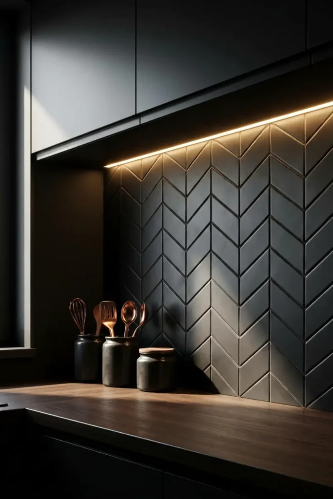
Chevron is one of those patterns that never sits quietly on a wall. The zigzag movement pulls your eye across the surface and instantly makes the backsplash the focal point of the entire kitchen.
I always recommend matte black for chevron because the flat finish keeps the pattern bold without feeling too harsh. Warm under-cabinet lighting softens the darkness and makes the whole space feel sleek and intentional.
Renter-Friendly Peel-and-Stick Marble
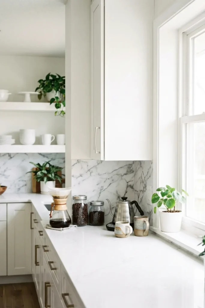
If you are renting or working with a tight budget, peel-and-stick marble tiles are genuinely one of the best upgrades you can make in an afternoon. No grout, no mess, no contractor needed.
The key to making it look real is clean wall prep and careful alignment at the edges. When applied correctly, the faux marble surface looks polished and fresh, especially styled with a coffee station and warm neutral accessories.
Antique Mirrored Glass
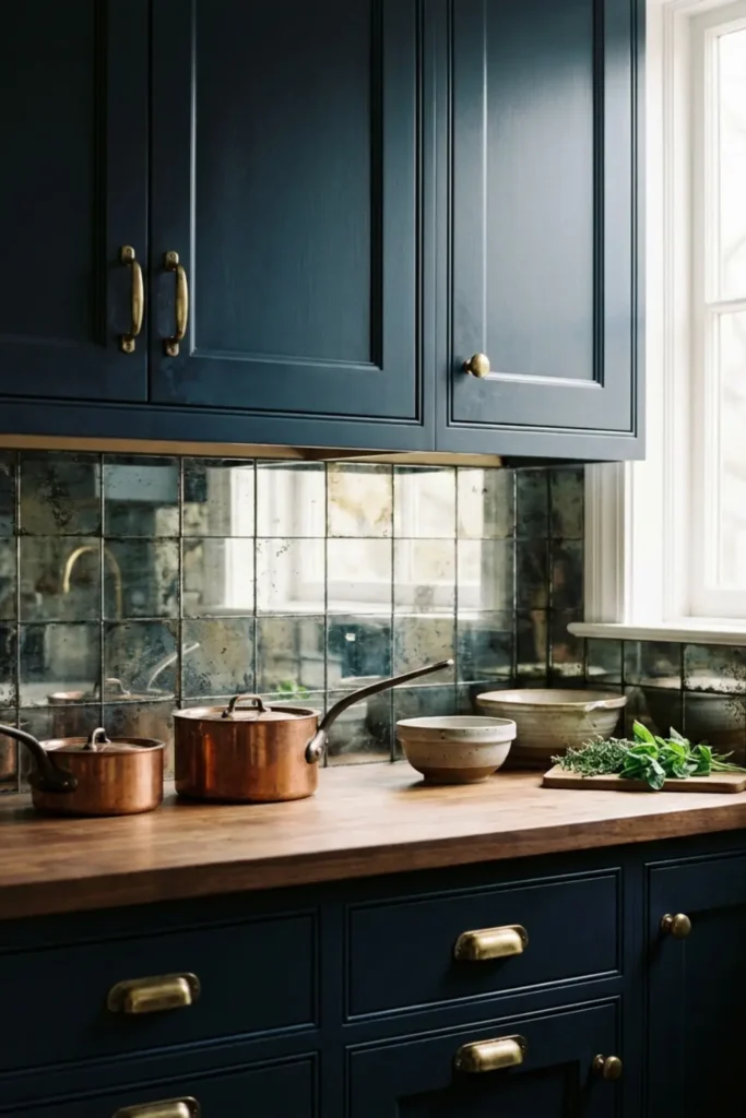
Antique mirrored glass tiles do two things at once: they add old-world glamour and they visually double the size of your kitchen. For small kitchens, this is genuinely one of the smartest tile choices you can make.
I love pairing this look with deep navy cabinetry and brass hardware. The aged mirror surface reflects the brass warmly, and the whole combination feels rich, layered, and beautifully collected rather than overdone.
Subtle Tone-on-Tone Herringbone
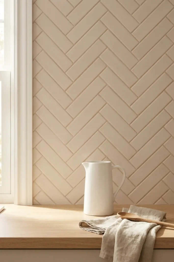
Tone-on-tone herringbone is my favorite choice for anyone who wants pattern without noise. Using soft beige tiles with a matching grout means the herringbone shows up as texture and dimension rather than a loud graphic statement.
This look works beautifully in traditional and transitional kitchens. A white ceramic pitcher, linen tea towels, and warm wood accents let the quiet elegance of the pattern breathe without competing for attention.
Checkerboard Marble Mosaic
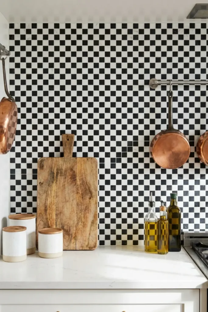
Checkerboard is back and honestly it never should have left. The small-scale marble mosaic version feels elevated and current rather than retro, especially when the tiles are kept petite and the grout stays tight and clean.
I keep this look modern by pairing it with flat-front cabinetry and simple hardware. A wooden cutting board leaning casually against the wall adds warmth and breaks up the graphic contrast beautifully.
Tumbled Travertine Stone
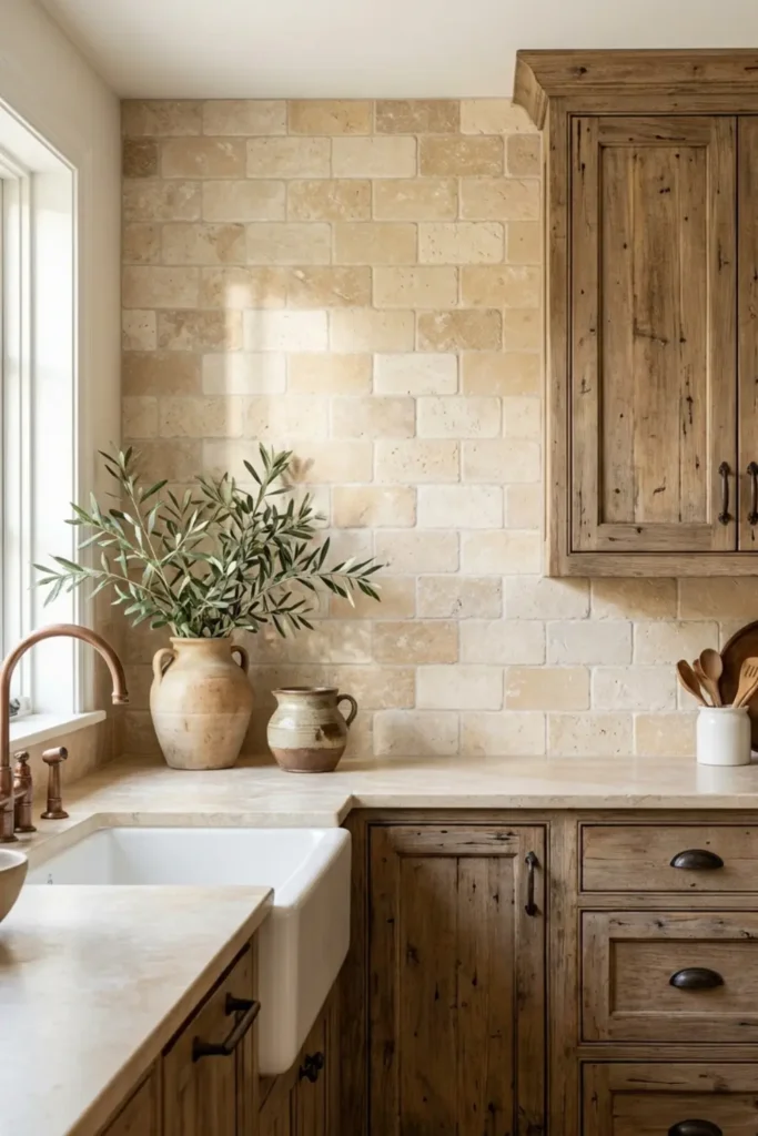
Tumbled travertine has this naturally worn, lived-in quality that no manufactured tile can replicate. The soft pitting and rounded edges make every single piece feel like it came straight from an old European kitchen, which is exactly the vibe I am after.
The most important step with travertine is sealing it properly. A good penetrating sealer protects the porous stone from kitchen grease and moisture while keeping all that warm, sandy character fully intact.
Moody Navy Blue Scallops
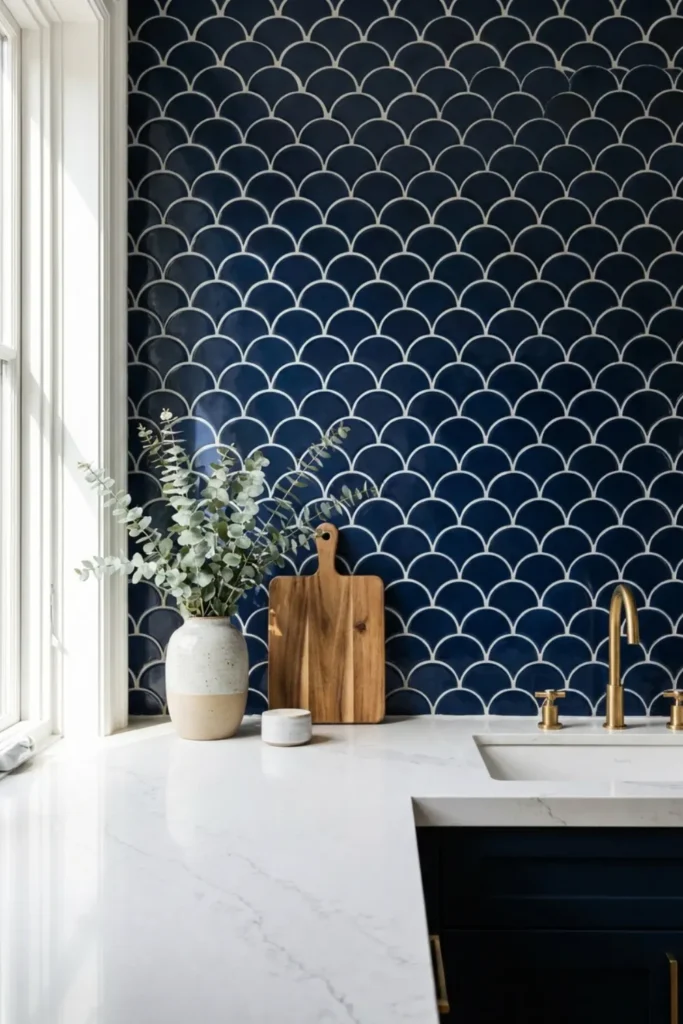
Scallop tiles bring something that most backsplash shapes simply cannot: softness. The curved edges break up the hard lines of countertops and cabinetry in a way that feels both playful and genuinely sophisticated at the same time.
Navy blue is my favorite colorway for scallops because it adds real depth without going fully dark. Paired against a white quartz countertop, the contrast is crisp, coastal, and completely inviting without ever feeling overdone.
Classic Beadboard Wood Paneling
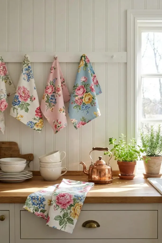
Beadboard is one of those quietly charming choices that makes a kitchen feel instantly cozy and collected. The vertical groove detail adds just enough visual texture to make the wall interesting without competing with anything else in the room.
For kitchens, the key is using moisture-resistant beadboard and sealing every panel edge properly before painting. A bright white finish keeps it fresh, and vintage floral tea towels complete that warm cottage-core feeling perfectly.
Minimalist Concrete Finish
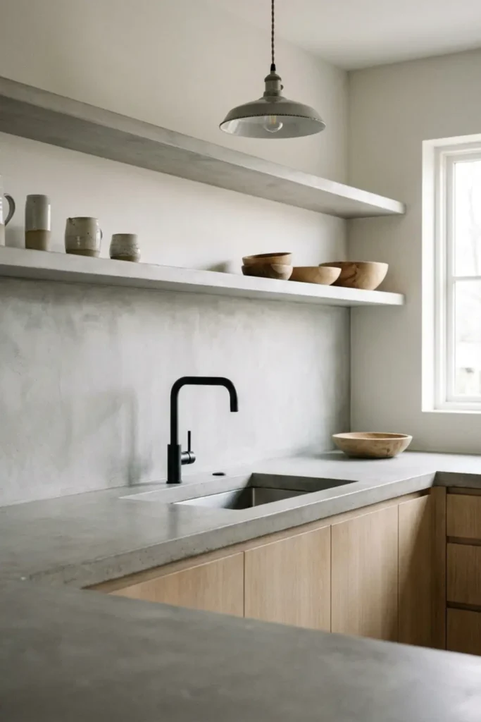
A smooth concrete backsplash is one of the most quietly confident design choices you can make. There are no patterns, no grout lines, no visual interruptions. Just one seamless, cool grey surface that lets every other element in the kitchen speak.
The trick to keeping concrete from feeling cold is layering in warmth everywhere else. Wooden shelving, woven textiles, and warm Edison lighting turn an industrial surface into something that feels surprisingly cozy and very intentional.
Moroccan Patterned Cement Tiles
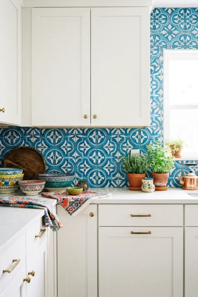
Moroccan cement tiles turn a backsplash into a full piece of art. The intricate geometric patterns in blue and white bring so much personality and visual energy that the wall becomes the undisputed focal point of the entire kitchen.
My approach with bold pattern tiles is always the same: keep everything else quiet. Simple white shaker cabinets, plain countertops, and minimal accessories let the tiles breathe and do exactly what they were made to do.
Seamless Quartz Match
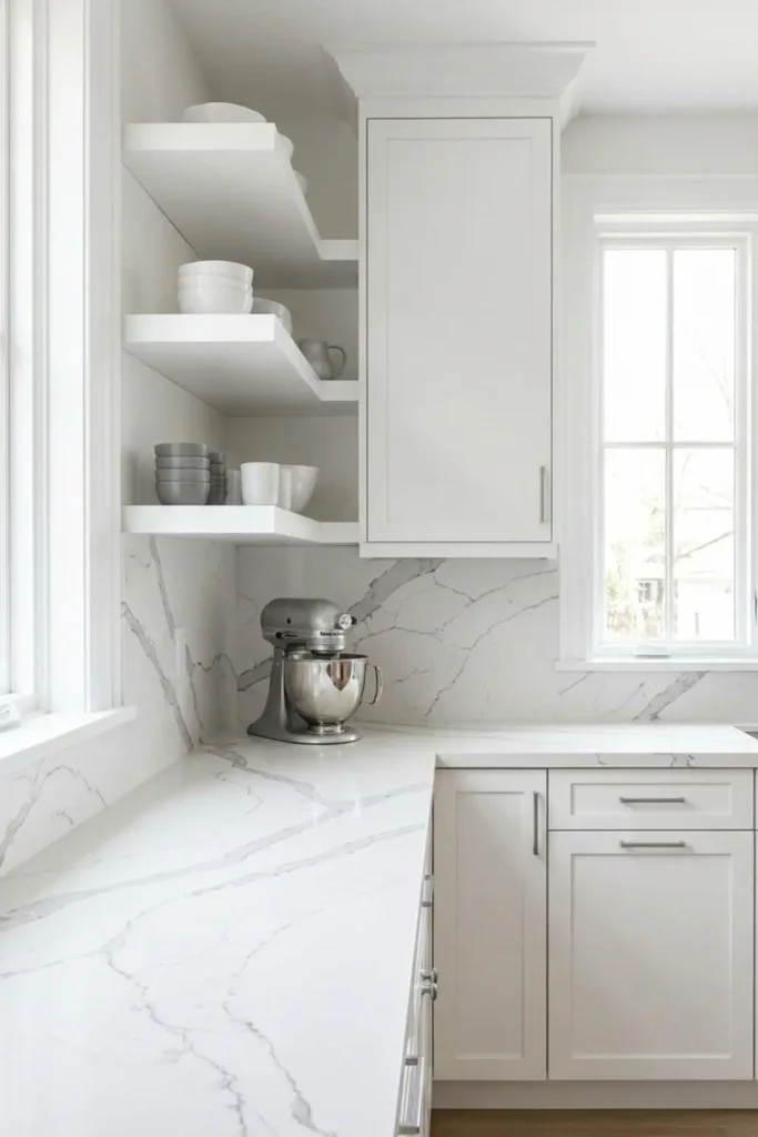
Running the same veined quartz from your countertop straight up the wall is one of the smartest design moves in a modern kitchen. The continuous surface eliminates visual breaks and makes the whole cooking zone feel expansive and cohesive.
Beyond the aesthetics, the practical benefits are real. Quartz is non-porous, stain resistant, and incredibly easy to wipe clean after cooking. No grout lines means no scrubbing, which makes this one of my top recommendations for busy kitchens.
Metallic Copper Penny Tiles
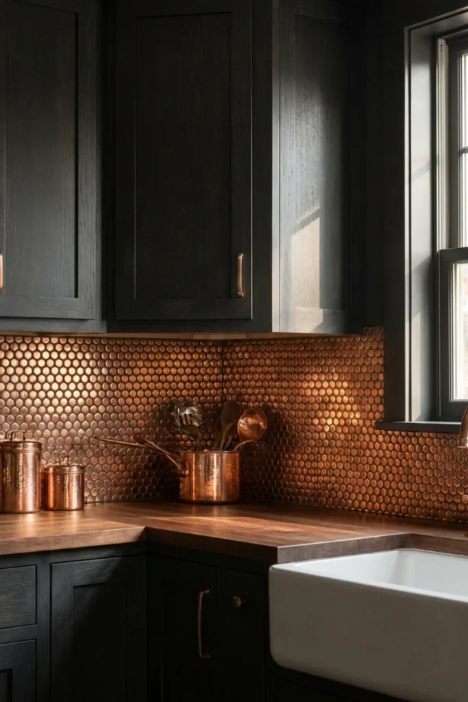
Copper penny tiles bring a warmth that no other metallic finish quite matches. The small round format catches light in dozens of directions at once, making the backsplash glow softly whether the sun is streaming in or the kitchen lights are on low.
What I love most about copper is that it lives and changes over time. The natural patina that develops gives the surface real character and depth, making your backsplash feel more beautiful and unique with every passing year.
Frosted Sea Glass Mosaics
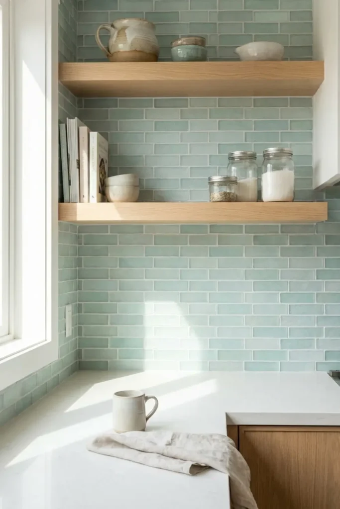
Sea glass mosaic tiles carry a softness that feels genuinely soothing to be around. The pale aqua and seafoam tones read almost like water caught in morning light, which makes the kitchen feel calm, fresh, and completely unhurried.
I always style this look with light oak shelving and white ceramic pieces to keep the palette airy. The natural wood grain alongside those cool coastal tones creates a balance that feels beachy without ever tipping into themed or overdone territory.
Hand-Painted Portuguese Tiles
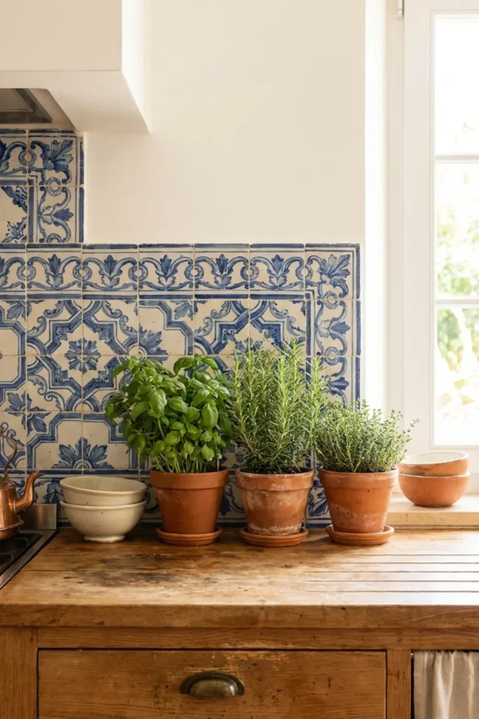
Hand-painted Portuguese Azulejo tiles carry centuries of craftsmanship in every single piece. The flowing blue and white motifs feel deeply artistic and completely unique, giving your kitchen a character that no mass-produced tile could ever come close to replicating.
I treat these tiles the same way I treat gallery art: let them lead. Terracotta herb pots on the counter, warm plaster walls, and simple wooden details frame the tiles beautifully and let that Mediterranean soul fill the entire room.
Thin Linear Finger Tiles (Kitkat Tiles)
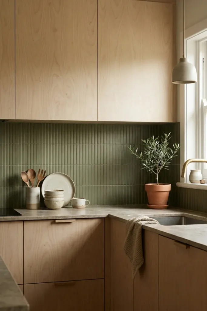
Kitkat tiles are one of those design details that look deceptively simple but add an incredible amount of quiet texture to a kitchen wall. The thin, finger-width strips create a soft ribbed surface that plays beautifully with natural light without ever feeling busy.
I love running them vertically in a matte olive green against light birch cabinetry. The earthy tone and clean Japandi sensibility make the whole kitchen feel grounded, intentional, and genuinely calming to cook in.
Whitewashed Exposed Brick
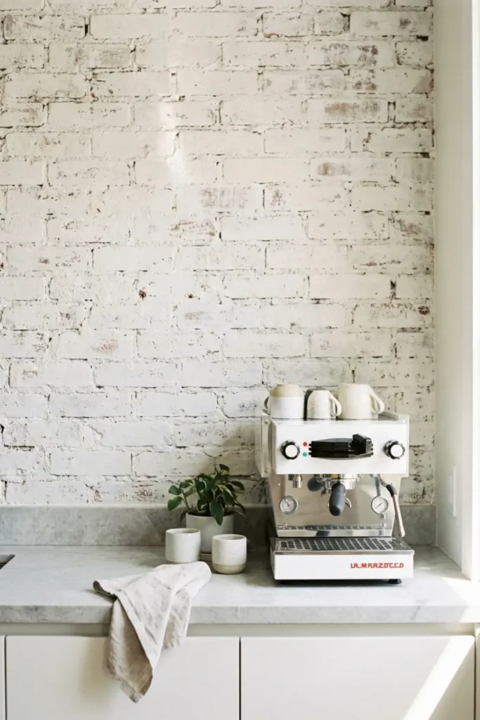
Raw brick brings soul to a kitchen in a way that tile rarely can. Whitewashing it keeps all that wonderful texture and depth while lifting the color enough to make the space feel bright, airy, and far less cave-like than untreated dark brick.
The one step most people skip is sealing. A clear matte sealer over the whitewashed surface locks in the finish and protects the brick from cooking grease and steam, which means it stays looking fresh for years without constant maintenance.
Iridescent Pearl Finish Hexagons
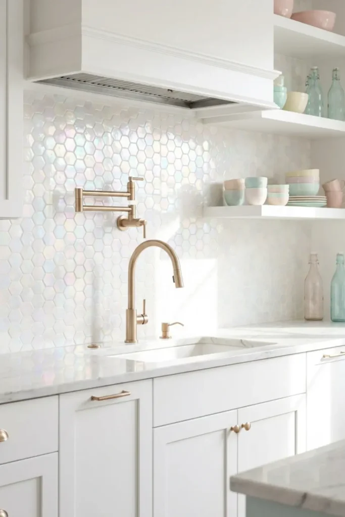
Pearl iridescent tiles are one of those surfaces that genuinely changes throughout the day. In morning light they blush soft pink. By afternoon they shift to silver. Under warm evening kitchen lighting they glow almost golden, which makes the whole backsplash feel alive and dynamic.
I particularly love this choice for kitchens that lack natural light. The reflective surface bounces whatever light is available around the room generously, making the space feel larger and more luminous than it actually is.
Geometric Cube Illusion (Tumbling Blocks)
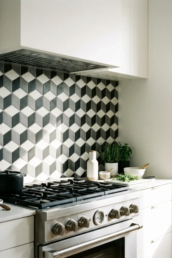
The tumbling block pattern creates a genuine optical illusion of stacked three-dimensional cubes on a completely flat wall. It is one of the boldest visual tricks in tile design and it works because the eye simply cannot stop reading depth into the pattern.
My advice is to use this one as an accent zone, specifically behind the stove rather than across the entire kitchen. A focused section in grey, white, and black keeps the effect dramatic and impactful without overwhelming the room entirely.
Warm Brushed Brass Metal Sheets
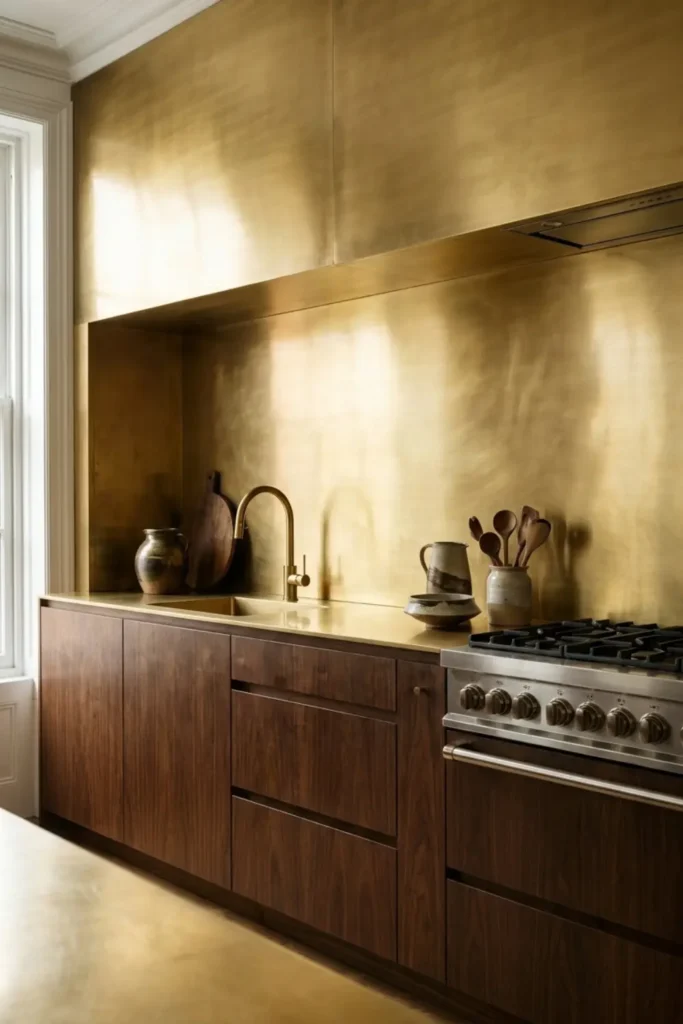
A continuous sheet of brushed brass is not a tile at all, and that is exactly what makes it so striking. The seamless surface catches light with a warm, golden glow that no ceramic or stone backsplash can replicate, giving the kitchen an undeniably luxurious and modern edge.
Paired against dark walnut cabinetry, brushed brass becomes genuinely breathtaking. The contrast between the deep, rich wood grain and that glowing metallic surface creates a combination that feels both warm and architecturally sophisticated.
Pastel Pink Square Grids
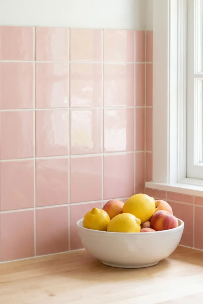
Pastel pink gets a bad reputation for being too sweet, but laid in a clean square grid with crisp white grout it becomes something else entirely. The structure of the grid modernizes the softness of the color and the result feels retro-inspired without being precious or overly feminine.
I style this look with pure white accessories and minimal open shelving. Keeping everything else clean and simple lets the pink read as a confident color choice rather than an afterthought.
Stenciled Painted Faux Tile
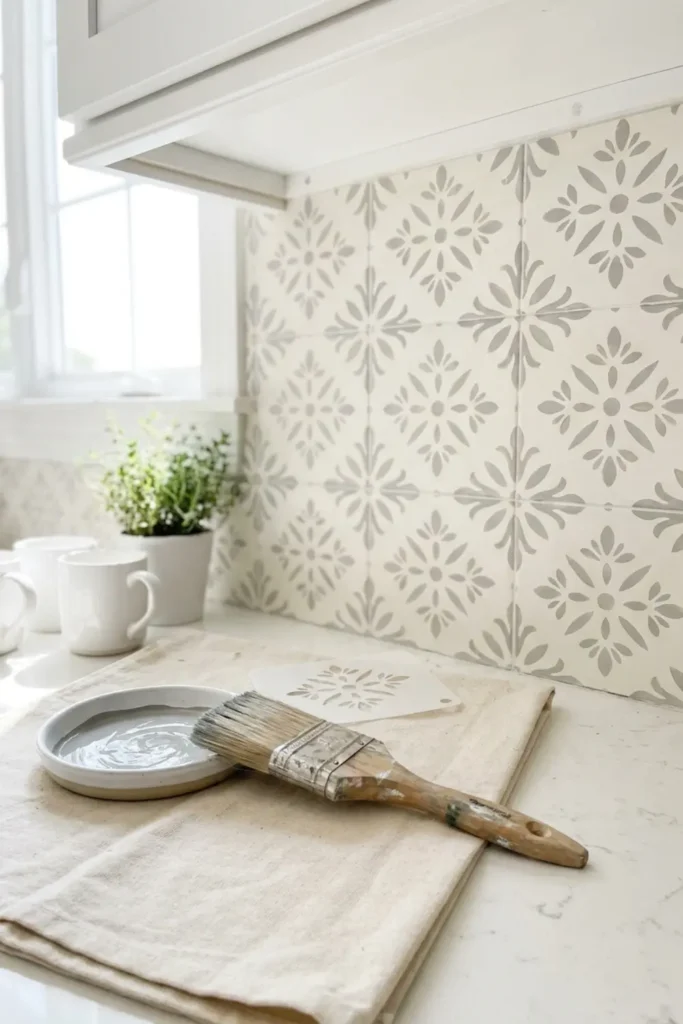
This is genuinely one of my favorite weekend transformations because the before and after difference is staggering for the cost of a stencil and a quart of paint. A subtle grey and white floral pattern gives the wall real personality without touching a single tile.
The finish coat is everything. Two layers of a scrubbable semi-gloss or satin sealer over the dried paint protects the surface from kitchen splashes and steam, keeping your hand-painted backsplash looking sharp and intentional for years.
Large Format Porcelain Slabs
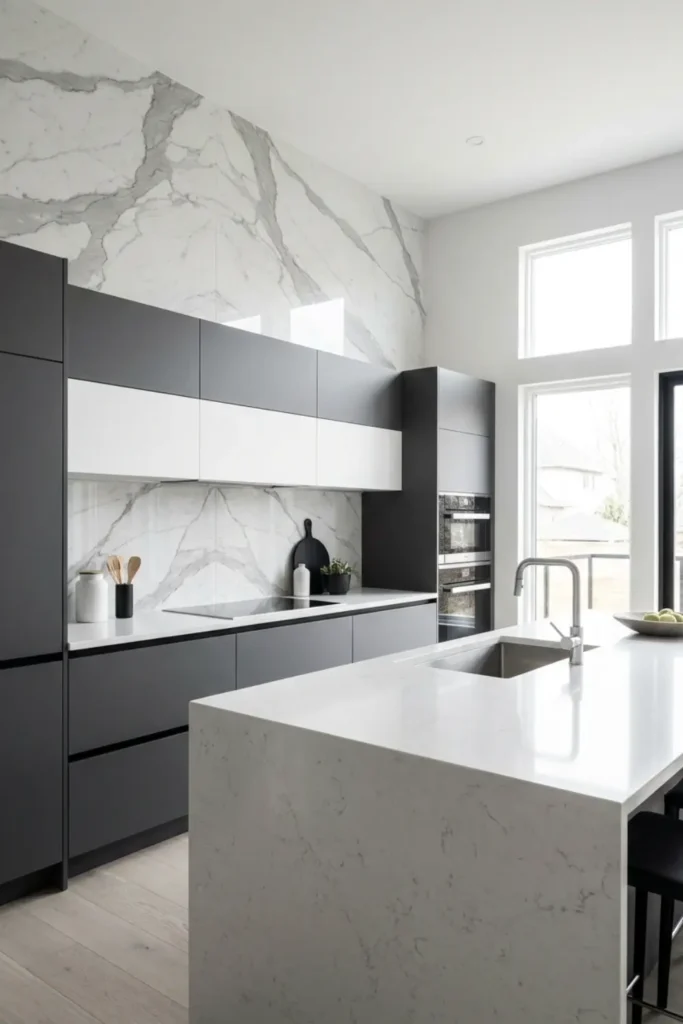
Here is a design industry secret: most people cannot tell the difference between a real marble slab backsplash and a large format porcelain one. Modern porcelain printing technology replicates the depth, veining, and movement of natural stone with remarkable accuracy at a fraction of the material cost.
Beyond the savings, porcelain outperforms marble in a kitchen environment. It is completely non-porous, requires zero sealing, and handles heat, grease, and daily cooking without a single complaint.
Textured Terrazzo Slabs
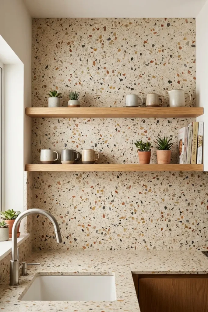
Terrazzo is one of those mid-century materials that feels completely fresh every time it comes back around. The speckled surface in warm beige, rust, and grey tones adds color and visual interest to the wall while remaining subtle enough to complement almost any cabinet color you pair it with.
What I particularly love about terrazzo in a kitchen is its practicality. The multi-toned speckled pattern camouflages everyday cooking splashes brilliantly, making it one of the most forgiving and genuinely low-maintenance backsplash surfaces available.
Vertical V-Groove Shiplap Boards
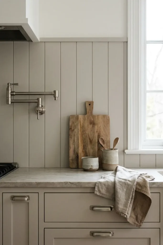
Traditional horizontal shiplap has had its moment, but vertical V-groove boards bring something more refined to the kitchen wall. The vertical lines pull the eye straight upward, adding the illusion of ceiling height and giving the whole space a cleaner, more architectural feeling.
Painting them in a soft mushroom greige rather than stark white adds warmth and depth while keeping the modern farmhouse spirit intact. The critical detail is using a scrubbable paint finish so the boards handle daily kitchen life without looking tired.
Two-Tone Split Wall
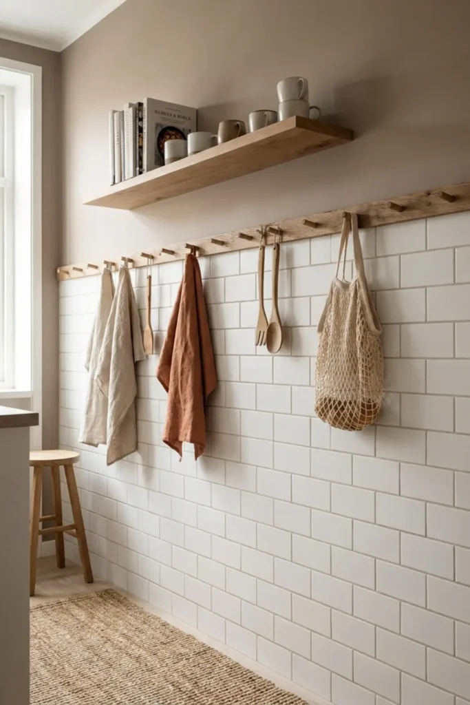
Tiling an entire wall costs significantly more than tiling half of it, and the two-tone split approach turns that budget constraint into an actual design feature. The lower half gets classic white subway tile for durability right where cooking splashes happen most, and the upper half gets a warm taupe paint that feels intentional and finished.
A wooden peg rail or slim floating shelf between the two zones acts as a natural dividing line. It caps the tile cleanly and gives you a practical spot to hang mugs or display small plants.
Final Thoughts
From classic white Zellige to hand-painted Portuguese tiles, there is a backsplash in this list for every kitchen personality and every budget. My biggest piece of advice is to trust the material that genuinely excites you, because that feeling always translates into a space you will love living in.
If one of these ideas made you stop scrolling, save this post and pin your favorite look for later.
FAQs
What is the most timeless kitchen backsplash?
White subway tile remains the most enduring choice in kitchen design. Its clean, rectangular format works across traditional, modern, and transitional styles without ever feeling dated.
What backsplash is easiest to clean?
Seamless surfaces win here. Large format porcelain slabs and continuous quartz panels have no grout lines to scrub, making daily kitchen cleanup genuinely quick and effortless.
Should my backsplash match my countertop?
It does not need to match, but it should complement. Choosing one material that shares a tone or undertone with your countertop creates a cohesive, pulled-together look without requiring an exact match.