
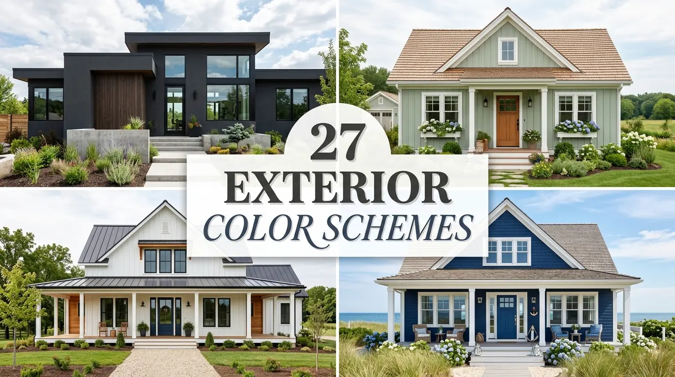
The right exterior color scheme can transform a forgettable facade into a showstopper. Start with the 60-30-10 rule: 60% siding color, 30% trim, and 10% accent (think front door or shutters). That balance alone does most of the heavy lifting.
One thing most people miss? Paint always reads lighter and brighter outdoors than it does on a swatch or inside a store. Always test a large painted sample panel on your actual exterior wall before committing.
My go-to approach is to work with your home’s fixed elements first, like the roof, brick, or stone, then build the palette around those. Fighting those undertones rarely ends well.
For a reliable starting point, I always recommend exploring the Sherwin-Williams Color Visualizer to preview combinations on your home’s style. And once the exterior feels fresh, updating your Front Porch Decor Ideas ties the whole look together beautifully.
Classic Off-White Siding with Black Trim and Cedar Accents
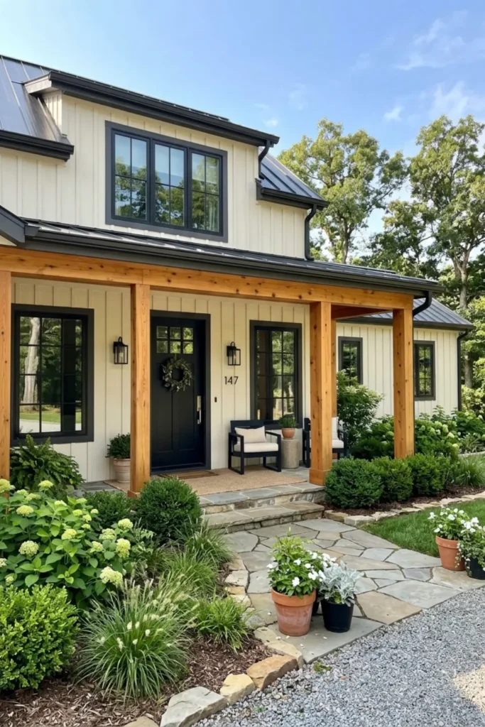
The Look: Crisp creamy white board-and-batten siding paired with near-black window frames and warm cedar porch pillars.
Why It Works: Off-white reflects natural light beautifully without feeling stark. The black trim grounds the palette while cedar adds warmth that stops the contrast from feeling cold.
How to Style: Keep the front door matte black or deep charcoal. Add cedar or wood-stained porch elements and layer in dark metal light fixtures to pull the whole scheme together.
Moody Charcoal Gray with Warm Brass and Stone Veneer
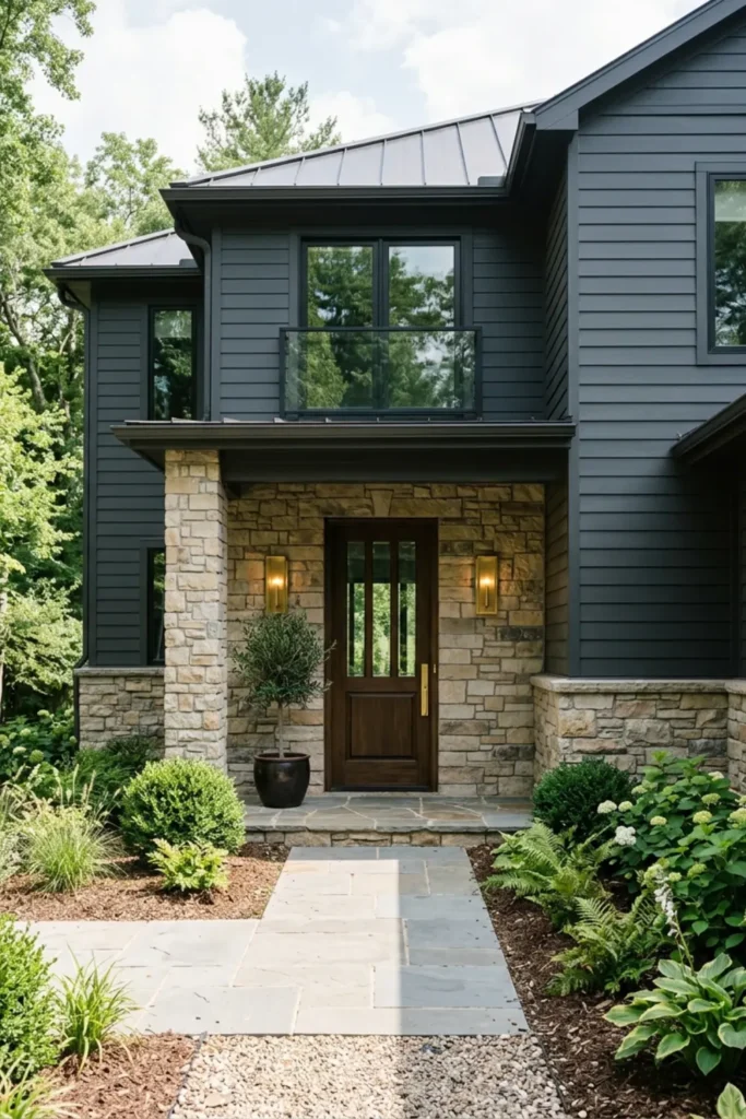
The Look: Deep charcoal lap siding anchored by a natural stacked stone foundation and glowing brass hardware details.
Why It Works: Charcoal has warm undertones that pair surprisingly well with golden brass. The stone veneer breaks up the darkness and adds organic richness the eye craves.
How to Style: Use a solid walnut or dark-stained wood door. Brass sconces on either side of the entry make the whole facade feel curated and luxurious.
Muted Sage Green with Creamy Trim and Natural Timber
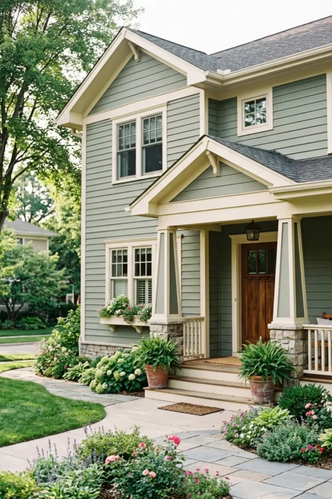
The Look: Soft, dusty sage horizontal siding with warm cream trim and a dark wood front door framed by potted greenery.
Why It Works: Sage green carries gray undertones that keep it from reading too vibrant outdoors. Creamy trim warms it up without the harshness of bright white.
How to Style: Pair with a mahogany or espresso-stained door. Add timber porch beams and woven rattan or terracotta planters to deepen the earthy, grounded feel.
Navy Blue Siding with Crisp White Trim and Natural Brick
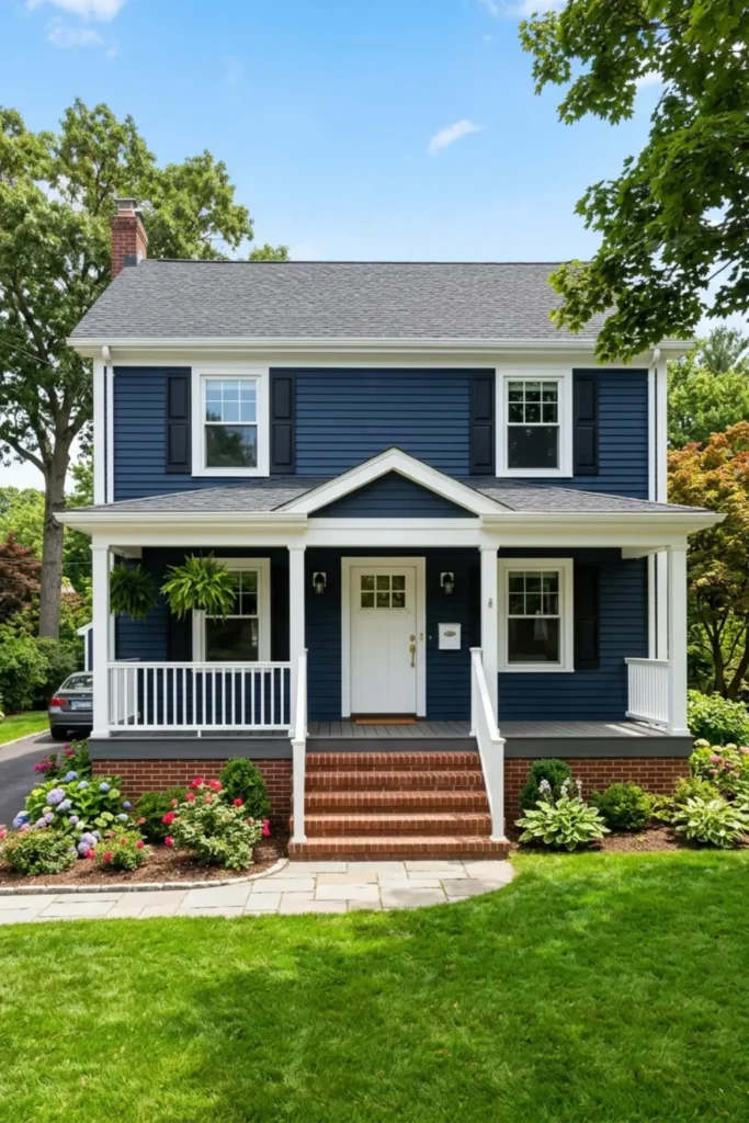
The Look: Bold, saturated navy siding contrasted with sharp white trim and warm red brick at the foundation or porch steps.
Why It Works: Navy reads rich and confident under direct sunlight. White trim creates a clean boundary, while brick softens the formality with natural, time-worn texture.
How to Style: Go with a white or glossy black front door. Brass or oil-rubbed bronze hardware bridges the gap between the cool navy and the warm brick tones effortlessly.
Warm Greige Siding with Black Windows and Stained Oak Door
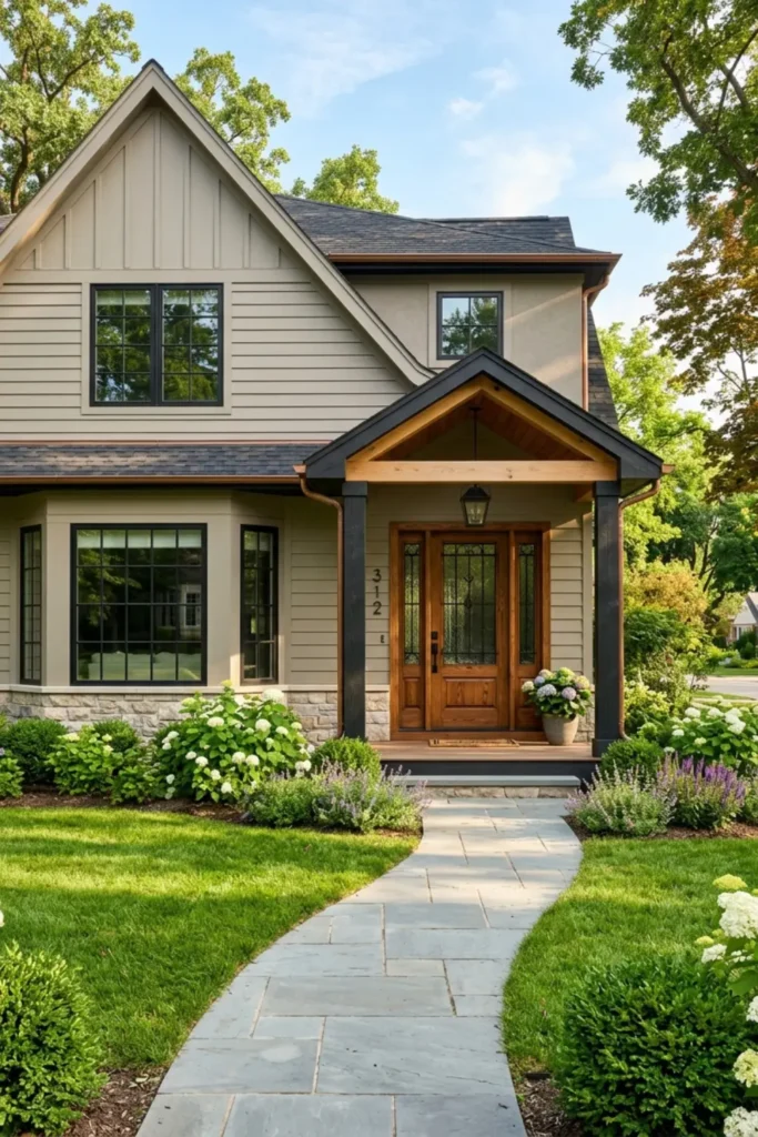
The Look: A perfectly balanced warm-neutral exterior with greige stucco or siding, black metal windows, and a rich honey-toned oak front door.
Why It Works: Greige avoids the pitfall of gray feeling too cold or beige feeling too dated. Under afternoon sunlight, it glows with subtle warmth that reads sophisticated rather than safe.
How to Style: Keep trim in a matching greige or soft linen. The oak door brings natural contrast, and matte black hardware on every element ties the modern and traditional details together cleanly.
Dusty Coastal Blue with White Shutters and Pale Coral Door
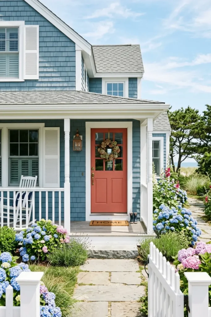
The Look: Soft, weathered blue shingle siding paired with bright white shutters and a muted coral front door that feels sun-kissed and welcoming.
Why It Works: Dusty blue has gray undertones that keep it grounded rather than playful. The coral door adds just enough warmth to prevent the palette from feeling washed out in direct coastal light.
How to Style: Add white window boxes overflowing with hydrangeas or trailing greenery. Keep porch furniture in natural white or driftwood tones to reinforce that relaxed, breezy coastal character.
Deep Forest Green with Bronze Accents and Warm Stone
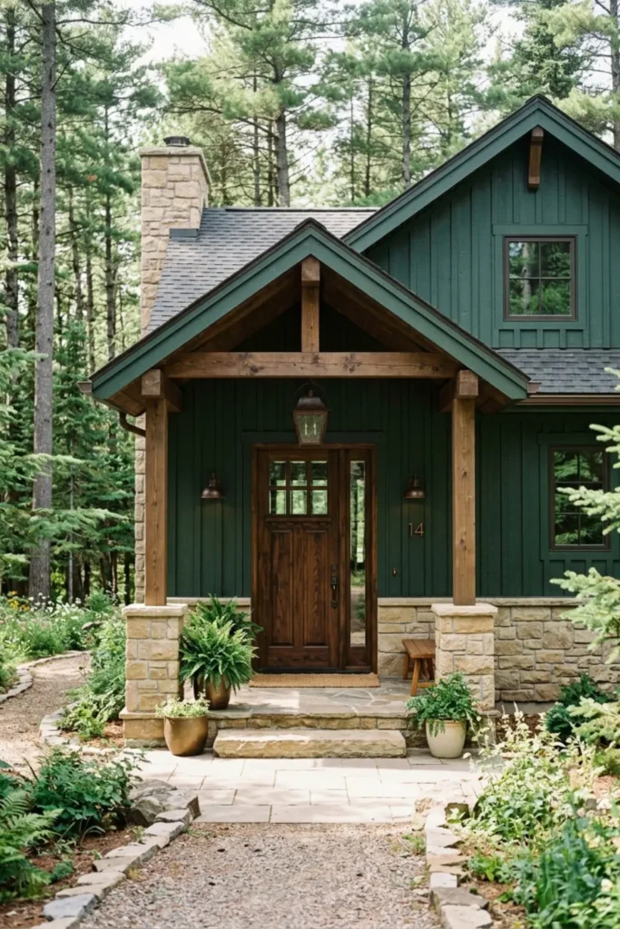
The Look: Rich, dark forest green siding anchored by warm beige stone trim and dark bronze light fixtures flanking a heavy timber front door.
Why It Works: Forest green absorbs light in a way that feels intentional and grounded. Bronze hardware picks up the yellow undertones in the stone, unifying the organic elements beautifully.
How to Style: Choose a dark-stained cedar or walnut door. Surround the entry with layered evergreen plantings to blur the line between architecture and landscape for a seamless, luxurious result.
Terracotta Siding with Creamy Vanilla Trim and Dark Iron
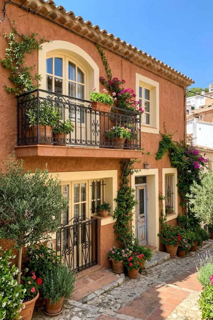
The Look: Warm terracotta stucco walls paired with creamy vanilla window trim and bold wrought iron railings and hardware throughout.
Why It Works: Terracotta carries red and orange undertones that deepen beautifully under strong sunlight. Vanilla trim softens the intensity while dark iron adds structure and contrast.
How to Style: Use olive or dusty green planters packed with succulents or lavender along the entry. An arched wooden door in espresso or dark walnut completes the Mediterranean mood effortlessly.
Soft Taupe Siding with Olive Green Door and Cream Trim
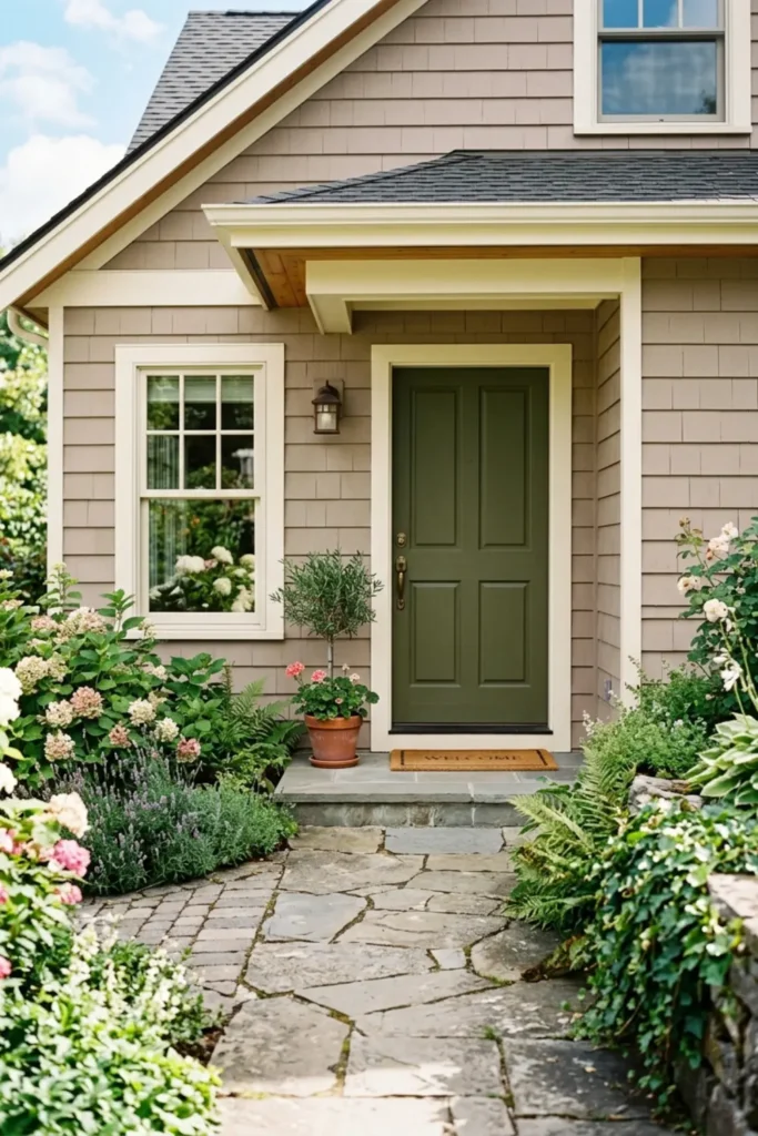
The Look: Quiet, warm taupe siding with off-white window frames and a deep olive green front door that feels earthy without trying too hard.
Why It Works: Taupe is one of the most forgiving exterior neutrals because its beige-gray balance adapts to changing daylight. Olive green adds personality while staying within the warm, natural family.
How to Style: Pair with a stone walkway and low ornamental grasses along the foundation. Bronze or antique brass door hardware keeps the palette cohesive and gives the entry a refined, intentional finish.
Crisp Pure White with Slate Gray Shutters and Black Door
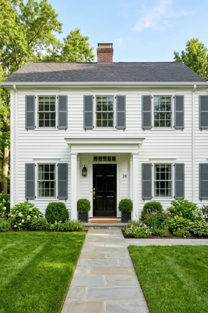
The Look: Timeless colonial white siding with medium slate gray shutters and a high-gloss black front door that commands attention from the street.
Why It Works: Pure white reads boldest in full morning sunlight, making the architectural lines of a traditional home pop dramatically. Slate gray shutters soften the contrast before the black door pulls focus exactly where you want it.
How to Style: Keep landscaping clean and structured with boxwood hedges or topiaries. Polished chrome or brushed nickel hardware on the door keeps the high-contrast scheme feeling sharp rather than heavy.
Slate Blue Siding with Dark Charcoal Trim and Light Wood
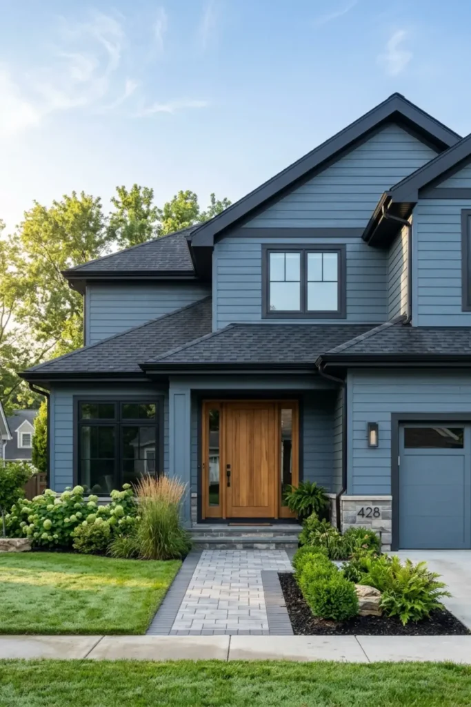
The Look: Cool-toned slate blue lap siding paired with deep charcoal trim and a natural teak or light oak front door that softens the whole palette.
Why It Works: Slate blue carries subtle purple undertones that shift beautifully in morning versus afternoon light. Charcoal trim sharpens the architecture while light wood prevents the scheme from feeling too cold or corporate.
How to Style: Keep landscaping soft with ornamental grasses or silver-leafed plants that echo the cool tones. Brushed nickel or gunmetal hardware on the door ties the charcoal trim into the entry without visual interruption.
Warm Cream Stucco with Chestnut Brown Trim and Copper Fixtures
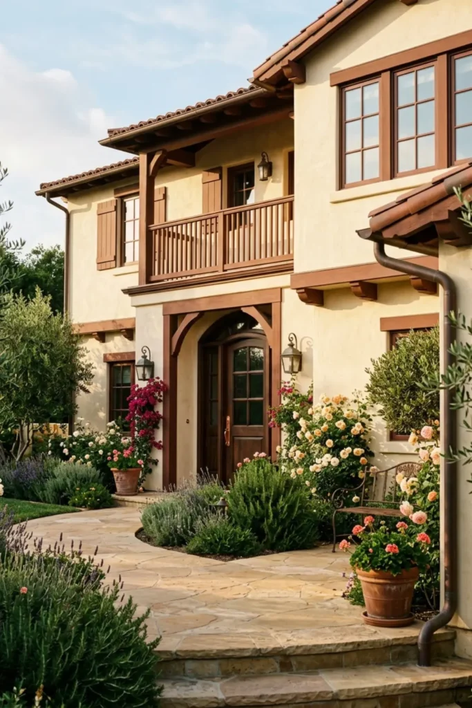
The Look: Elegant cream stucco walls with rich chestnut brown timber accents, copper gutters, and warm-toned wall sconces that glow against the facade.
Why It Works: Cream stucco is incredibly forgiving across all lighting conditions, reading warm at sunrise and sophisticated under midday brightness. Copper develops a natural patina over time that only adds character.
How to Style: Plant tall ornamental grasses or olive trees along the entry path. A dark espresso or mahogany arched door reinforces the estate feel and grounds the warmth of the copper details above.
Olive Green Siding with Black Trim and Natural Stone
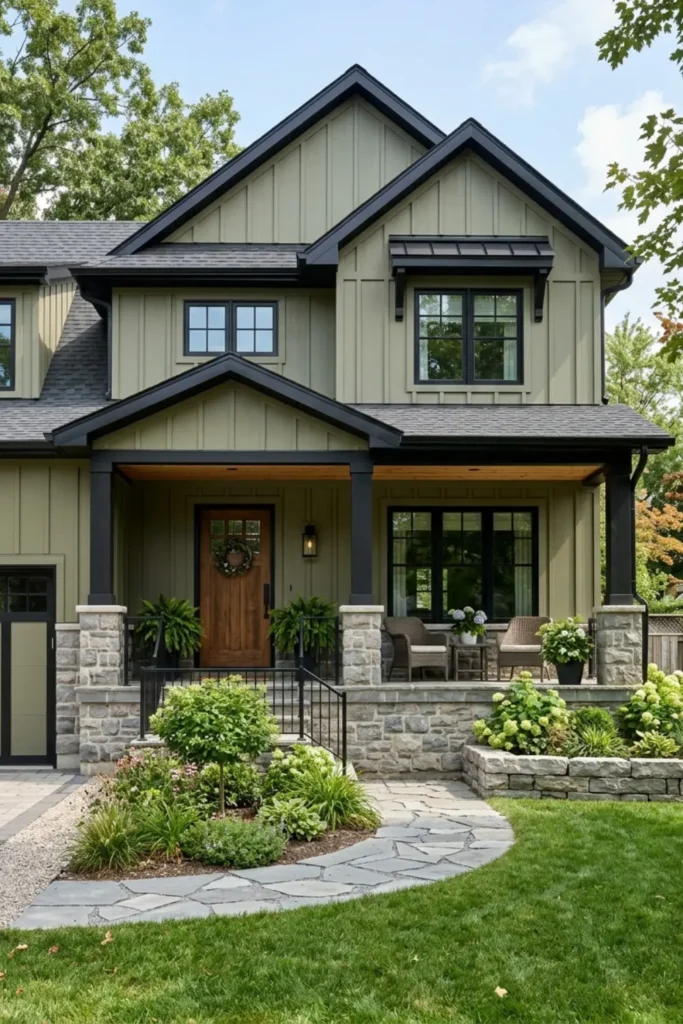
The Look: Muted olive green board-and-batten siding with sharp black metal window casings and a gray fieldstone foundation that anchors the whole composition.
Why It Works: Olive green straddles warm and cool beautifully, making it one of the most versatile exterior greens available. Black trim modernizes it instantly while natural stone keeps the palette feeling rooted and organic.
How to Style: Choose a solid black or dark walnut front door. Low-growing ground cover along the stone foundation softens the transition from architecture to landscape and adds texture right where the eye naturally lands.
Matte Black Siding with Warm Cedar Slats and White Trim
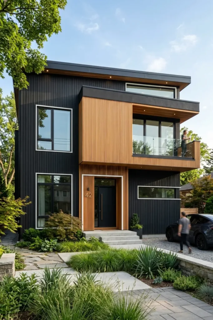
The Look: Dramatic matte black vertical siding broken up with horizontal cedar wood slats and crisp white accent borders framing each window.
Why It Works: Matte black absorbs light rather than reflecting it, giving the home a sculptural, architectural quality. Cedar introduces warmth that stops the facade from feeling stark, and white trim defines every structural edge with precision.
How to Style: Keep the front door in natural cedar or a warm walnut stain to carry the wood tone through to the entry. Minimalist black planters with structural plants like agave or tall grasses complete the modern look.
Pale Butter Yellow Siding with Crisp White Trim and Dark Slate Roof
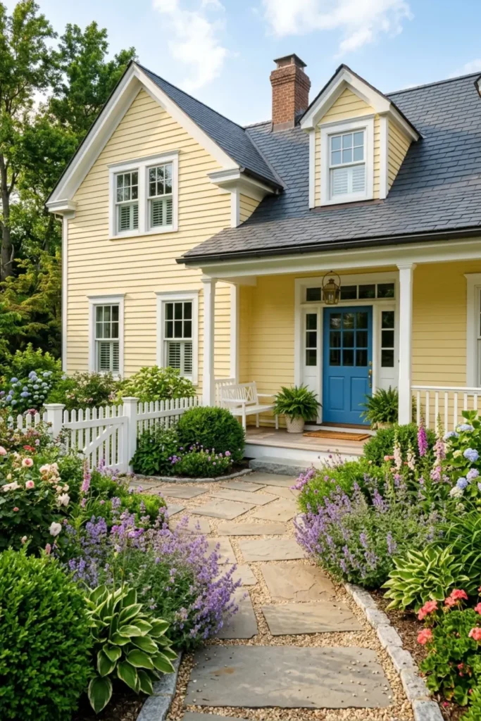
The Look: Sunny, cheerful butter yellow horizontal siding with sharp white trim, a dark slate gray roof, and a deep blue front door that pulls the eye straight to the entry.
Why It Works: Pale yellow carries warm golden undertones that pop beautifully under direct sunlight without feeling overwhelming. The dark slate roof provides the grounding contrast the palette needs to feel intentional rather than sweet.
How to Style: Use white window boxes with trailing flowers in blue or purple tones to echo the door color. Black or oil-rubbed bronze hardware adds just enough edge to keep the cheerful palette from tipping into overly traditional.
Warm Sandstone Siding with Deep Walnut Door and Black Accents
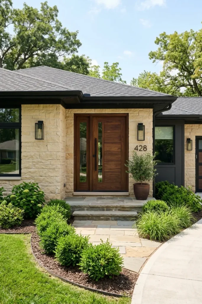
The Look: Soft sandstone beige siding paired with a rich dark walnut front door and matte black lighting fixtures that anchor the warm neutral palette.
Why It Works: Sandstone carries yellow and pink undertones that deepen beautifully in afternoon sunlight. Black accents prevent the warm tones from blending together while the walnut door adds natural richness right at the focal point.
How to Style: Use black metal house numbers and a matching black-framed exterior lantern on each side of the entry. Keep foundation planting low and structured with dark green boxwoods to let the siding color breathe.
Pale Pewter Gray with Navy Shutters and White Portico
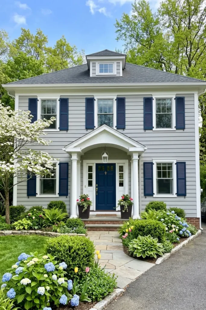
The Look: Quiet, refined pewter gray siding with deep navy blue shutters and a crisp white columned portico that frames the entry with classic architectural confidence.
Why It Works: Pewter gray has cool blue undertones that make navy shutters feel like a natural extension of the palette rather than a contrast. The white portico acts as a brightness anchor that stops the scheme from reading too heavy.
How to Style: Choose a navy or deep charcoal front door to echo the shutters. Add bright white trim around all windows and finish with polished nickel or chrome fixtures that complement the cool tones throughout.
Rust Orange Brick with Soft Off-White Siding and Charcoal Trim
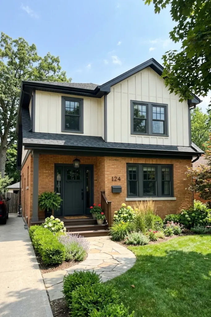
The Look: Original warm rust-orange brick on the lower level modernized with clean off-white siding above and dark charcoal gutters, trim, and window casings throughout.
Why It Works: Off-white neutralizes the brick’s intensity without competing with it. Charcoal trim bridges the two materials, giving the home a cohesive updated look that respects the original character while feeling unmistakably current.
How to Style: Paint the front door in a deep charcoal or matte black to unify the upper and lower elements. Add brushed black hardware and modern coach-style lighting to complete the renovation without a full reclad.
Dusty Plum Siding with Warm Cream Trim and Brass Accents
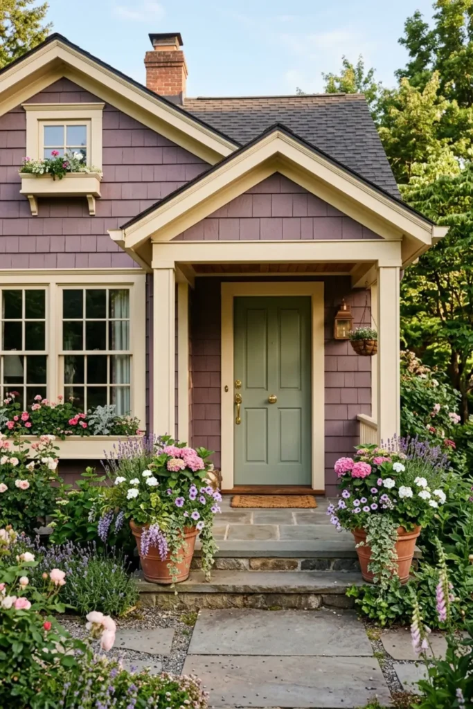
The Look: Moody, muted dusty plum shingle siding softened by warm cream window trim and polished brass door hardware that catches golden light beautifully.
Why It Works: Dusty plum is a complex color with red, gray, and purple undertones that shift dramatically depending on the time of day. Cream trim warms it down from feeling gothic while brass adds just enough glamour to feel intentional.
How to Style: Hang a statement brass pendant or lantern at the entry. Pack window boxes with soft pink and cream florals to echo the plum tones in a lighter, more inviting way at street level.
Pale Mint Green with White Trim and Light Cedar Porch
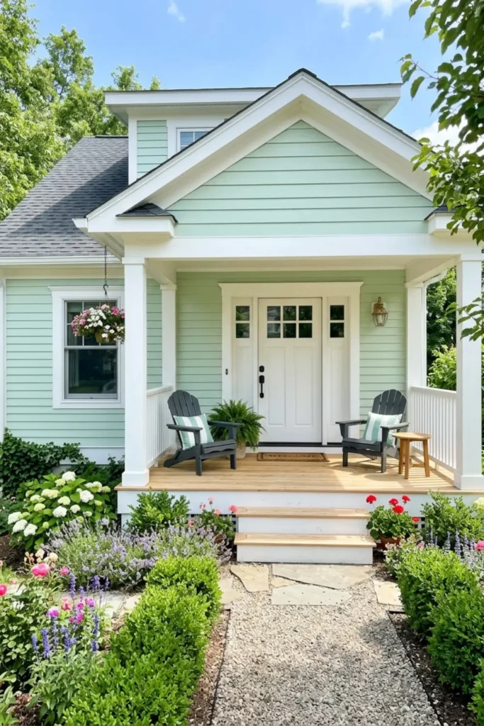
The Look: Soft, airy pale mint green siding with crisp white trim, a white front door, and a light cedar porch deck that gives the whole exterior a fresh, sun-drenched quality.
Why It Works: Pale mint carries blue-green undertones that feel cooling and refreshing without reading too saturated outdoors. Light cedar decking warms the base of the home so the palette never tips into feeling clinical or cold.
How to Style: Add white rocking chairs or a porch swing with soft linen cushions. Trailing white or pink florals in simple terracotta pots along the porch steps keep the retro coastal character without overcomplicating the look.
Dark Teal Siding with Sand Trim and Natural Timber Accents
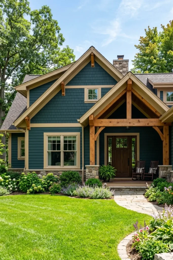
The Look: Deep, jewel-toned teal siding paired with warm sand beige window trim and chunky natural timber porch brackets that bring the whole palette back to earth.
Why It Works: Dark teal carries both blue and green undertones that shift dramatically between morning shade and afternoon sun. Sand trim keeps the contrast warm rather than stark, which stops the moody color from feeling heavy on smaller homes.
How to Style: Choose a dark walnut or espresso stained front door to ground the entry. Add black metal light fixtures and keep foundation plants lush and layered to complement the richness of the teal.
Soft Greige Stucco with Dark Espresso Shutters and Iron Lanterns
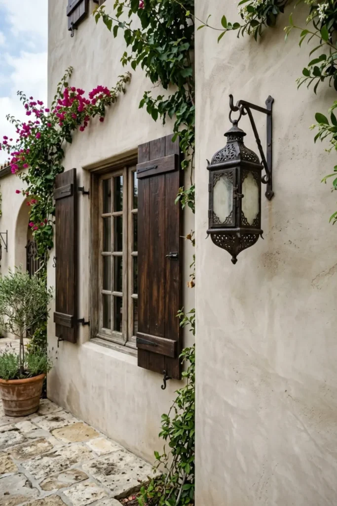
The Look: Smooth, soft greige stucco walls accented with dark espresso wood shutters and oversized wrought iron wall lanterns that frame the entry with old-world elegance.
Why It Works: Greige stucco is one of the most light-adaptive exterior finishes available. In bright indirect light it reads warm and inviting, while evening shadows deepen it into something that feels genuinely luxurious.
How to Style: Use a heavy arched door in dark espresso or mahogany. Lay stone or terracotta pavers at the entry and add low ornamental plantings to reinforce the Mediterranean character without cluttering the clean stucco surface.
Warm Clay Siding with Forest Green Door and Off-White Trim
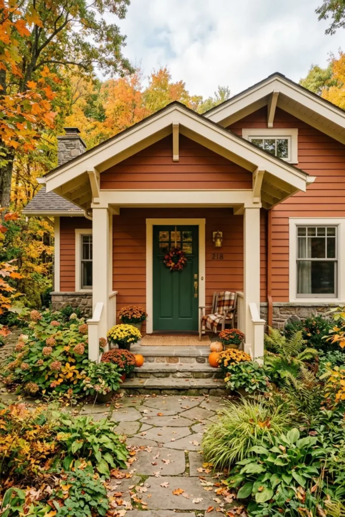
The Look: Cozy terracotta clay siding with clean off-white window trim and a deep forest green front door that grounds the warm palette with a confident, natural contrast.
Why It Works: Clay carries red and orange undertones that intensify beautifully in natural daylight. Forest green sits directly opposite warm red tones on the color wheel, creating a contrast that feels instinctively balanced and earthy.
How to Style: Add a weathered bronze door knocker and matching light fixtures. Layer the porch with terracotta planters filled with herbs or trailing vines to extend the craftsman bungalow energy all the way to the street.
Swedish Falu Red Siding with White Trim and Black Roof
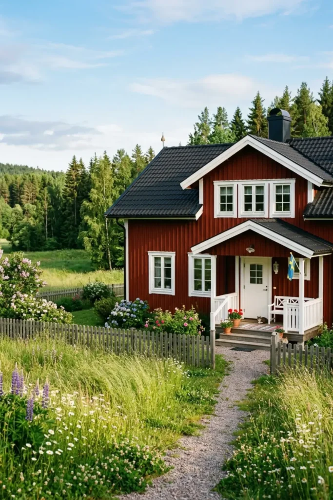
The Look: Rich, traditional barn red wooden siding with bright white window frames and a crisp black shingle roof that makes the whole composition feel timeless and deliberately Scandinavian.
Why It Works: Falu red is one of the most historically grounded exterior colors in existence. Its deep iron-oxide pigment resists fading beautifully and reads with incredible warmth against both white trim and dark roofing under northern and direct sunlight alike.
How to Style: Keep trim details generous and bright. Add window boxes with white or yellow florals to soften the boldness of the red. Simple black iron door hardware and a painted white door complete the Nordic farmhouse look with authentic restraint.
Dove Gray Siding with Soft Sage Door and White Trim
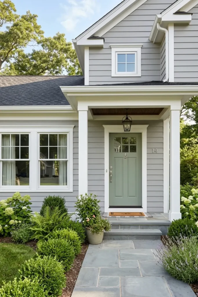
The Look: Calm, collected dove gray siding with crisp white trim and a muted sage green front door that delivers understated personality without disrupting the quiet palette.
Why It Works: Dove gray has a near-perfect balance of warm and cool undertones, making it one of the safest exterior neutrals across all light conditions. The sage door reads as a natural extension of the gray rather than a bold statement, which is exactly the point.
How to Style: Use brushed silver or satin nickel hardware on the door to echo the cool gray tones. Plant soft lavender, white salvia, or silver-leafed shrubs along the foundation to reinforce the gentle, sophisticated mood at ground level.
Charcoal Board and Batten with Light Stone Foundation
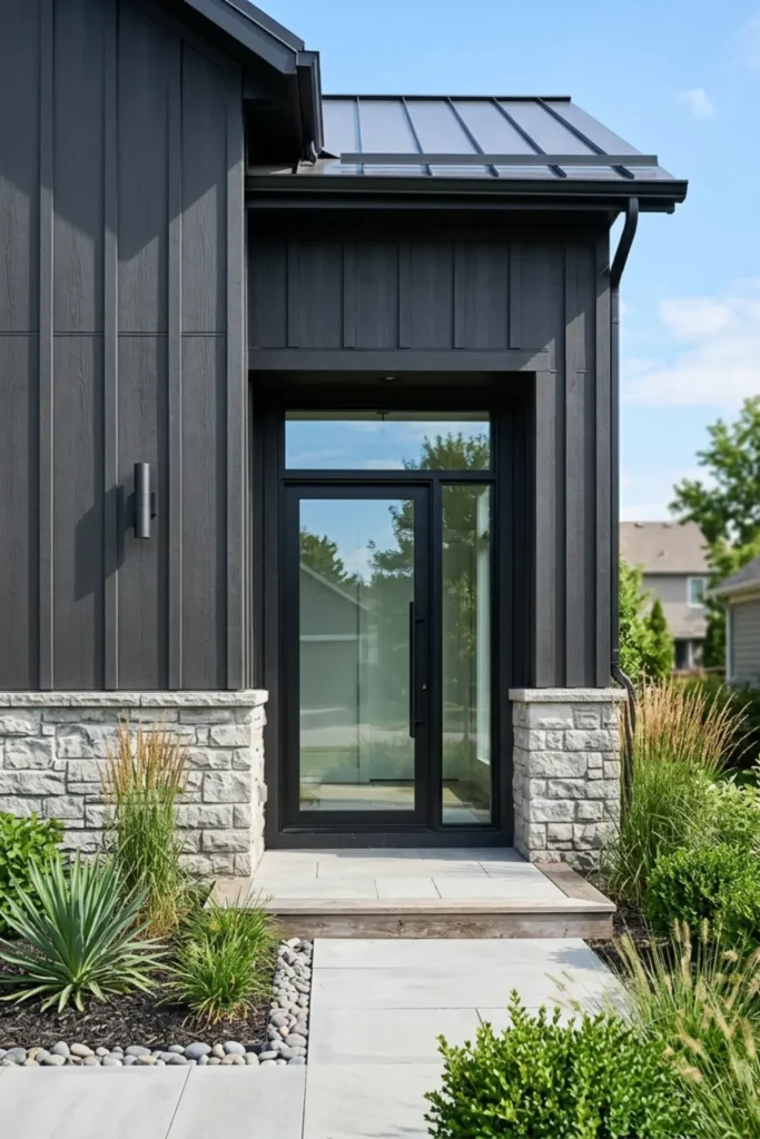
The Look: Vertical dark charcoal board and batten siding over a light gray stacked stone foundation, with a glass or steel entry door that makes the whole facade feel unmistakably current.
Why It Works: The vertical lines of board and batten draw the eye upward, making homes feel taller and more architectural. Light stone at the base creates a natural visual anchor that keeps the dark upper siding from overwhelming the composition.
How to Style: Keep the entry minimal with a frameless glass door or a solid steel pivot door. Use concrete or large-format stone pavers at the entry path and add a single statement planter in a matte black finish to maintain the clean, modern tension.
Soft Mushroom Siding with Cream Trim and Natural Cedar Door
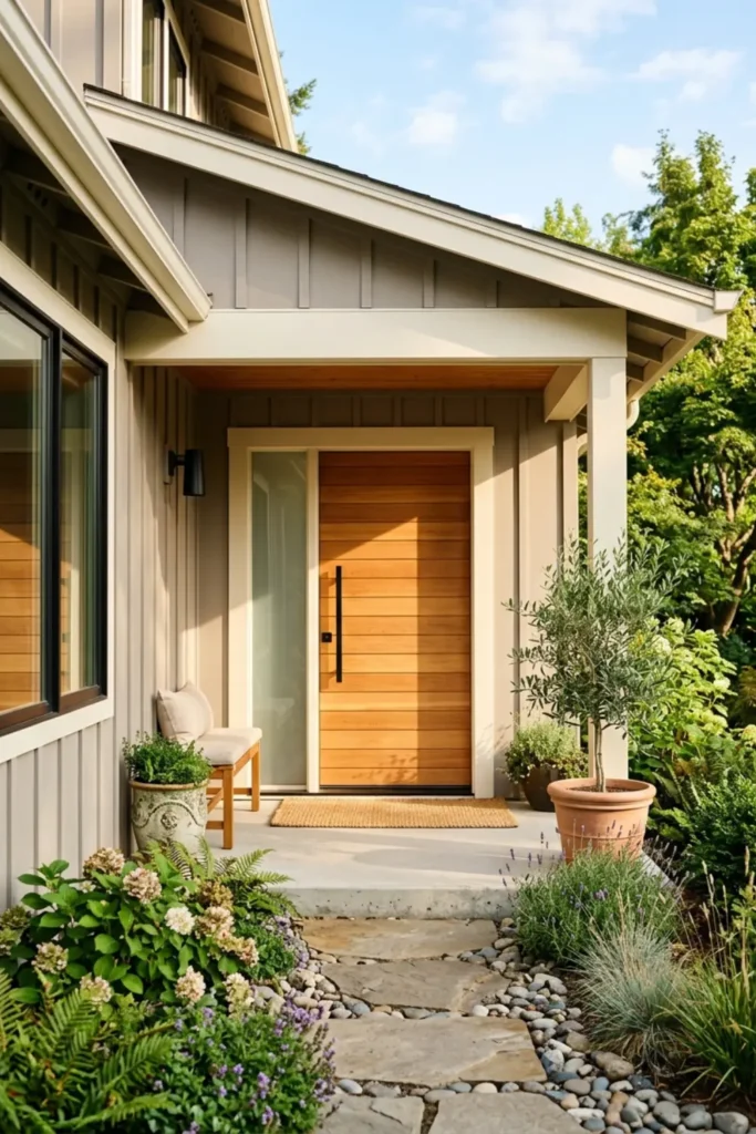
The Look: Warm gray-beige mushroom siding with smooth cream trim and a beautiful horizontal cedar plank front door that brings natural warmth directly to the entry.
Why It Works: Mushroom is one of the most sophisticated neutrals trending in exterior design right now. It avoids the coldness of pure gray and the datedness of traditional beige, landing in a space that feels organic, current, and genuinely timeless.
How to Style: Let the cedar door be the star. Keep all hardware in unlacquered brass or warm bronze to complement the wood grain. Add lush, trailing greenery on either side of the entry and finish with cream-toned outdoor lighting for an after-dark curb appeal that is just as strong.
Essential Rules for Choosing Your Exterior Paint Colors
Getting the palette right comes down to a few principles that professional designers use every time.
The 60-30-10 rule is your foundation. Sixty percent of the visible exterior should be your siding color, thirty percent your trim and gable details, and the remaining ten percent is reserved for your front door, shutters, or accent elements. That ratio creates balance without making the home feel flat or monotonous.
Light Reflectance Value (LRV) matters more outdoors than anywhere else. Colors with a high LRV (above 70) reflect sunlight aggressively and can look nearly white in full afternoon sun. Darker shades with a low LRV absorb heat and deepen in tone under direct light. Always choose your exterior paint with its outdoor LRV behavior in mind, not how it looks on an indoor swatch.
One rule I always follow: paint large sample boards and lean them directly against your exterior wall. Check them at three different times of day, morning, midday, and dusk, before making any final decision. What looks perfect at noon can surprise you completely by late afternoon.
Frequently Asked Questions About Exterior Paint Schemes
What exterior color makes a house look bigger?
Light neutrals are your best tool here. Off-white, soft greige, and pale blue all reflect more natural light, which visually expands the facade. Keeping the trim close in tone to the siding (rather than high-contrast) also removes the visual boundaries that make a home feel smaller and more segmented.
How do I choose an exterior paint color that matches my roof?
Always match undertones, not surface color. A cool gray or charcoal roof pairs naturally with exterior blues, slate grays, and soft greens that share those same cool undertones. A warm brown, black, or weathered wood roof works beautifully with taupe, off-white, warm greige, olive green, and clay tones that sit in the same warm family. When undertones align, the home reads as a cohesive whole rather than a collection of mismatched materials.
Final Thoughts on Boosting Your Curb Appeal
Choosing an exterior color scheme is one of the highest-impact changes you can make to your home, and it does not have to be overwhelming. Start with what you cannot change, your roof, brick, or stonework, then build outward from there.
Order peel-and-stick paint samples, inspect them morning and evening, and save your favorite combinations to a Pinterest board so you can compare side by side. The right palette is out there, and now you have 27 starting points to find it.


